Wednesday 12 April 2023

Passkeys: What the Heck and Why?

These things called passkeys sure are making the rounds these days. They were a main attraction at W3C TPAC 2022, gained support in Safari 16, are finding their way into macOS and iOS, and are slated to be the future for password managers like 1Password. They are already supported in Android, and will soon find their way into Chrome OS and Windows in future releases.

Geeky OS security enhancements don’t exactly make big headlines in the front-end community, but it stands to reason that passkeys are going to be a “thing”. And considering how passwords and password apps affect the user experience of things like authentication and form processing, we might want to at least wrap our minds around them, so we know what’s coming.

That’s the point of this article. I’ve been studying and experimenting with passkeys — and the WebAuthn API they are built on top of — for some time now. Let me share what I’ve learned.

Table of contents

Terminology

Here’s the obligatory section of the terminology you’re going to want to know as we dig in. Like most tech, passkeys are wrought with esoteric verbiage and acronyms that are often roadblocks to understanding. I’ll try to de-mystify several for you here.

  • Relying Party: the server you will be authenticating against. We’ll use “server” to imply the Relying Party in this article.
  • Client: in our case, the web browser or operating system.
  • Authenticator: Software and/or hardware devices that allow generation and storage for public key pairs.
  • FIDO: An open standards body that also creates specifications around FIDO credentials.
  • WebAuthn: The underlying protocol for passkeys, Also known as a FIDO2 credential or single-device FIDO credentials.
  • Passkeys: WebAuthn, but with cloud syncing (also called multi-device FIDO credentials, discoverable credentials, or resident credentials).
  • Public Key Cryptography: A generated key pair that includes a private and public key. Depending on the algorithm, it should either be used for signing and verification or encrypting and decrypting. This is also known as asymmetric cryptography.
  • RSA: An acronym of the creators’ names, Rivest Shamir and Adel. RSA is an older, but still useful, family of public key cryptography based on factoring primes.
  • Elliptic Curve Cryptography (ECC): A newer family of cryptography based on elliptic curves.
  • ES256: An elliptic curve public key that uses an ECDSA signing algorithm (PDF) with SHA256 for hashing.
  • RS256: Like ES256, but it uses RSA with RSASSA-PKCS1-v1.5 and SHA256.

What are passkeys?

Before we can talk specifically about passkeys, we need to talk about another protocol called WebAuthn (also known as FIDO2). Passkeys are a specification that is built on top of WebAuthn. WebAuthn allows for public key cryptography to replace passwords. We use some sort of security device, such as a hardware key or Trusted Platform Module (TPM), to create private and public keys.

The public key is for anyone to use. The private key, however, cannot be removed from the device that generated it. This was one of the issues with WebAuthn; if you lose the device, you lose access.

Passkeys solves this by providing a cloud sync of your credentials. In other words, what you generate on your computer can now also be used on your phone (though confusingly, there are single-device credentials too).

Currently, at the time of writing, only iOS, macOS, and Android provide full support for cloud-synced passkeys, and even then, they are limited by the browser being used. Google and Apple provide an interface for syncing via their Google Password Manager and Apple iCloud Keychain services, respectively.

How do passkeys replace passwords?

In public key cryptography, you can perform what is known as signing. Signing takes a piece of data and then runs it through a signing algorithm with the private key, where it can then be verified with the public key.

Anyone can generate a public key pair, and it’s not attributable to any person since any person could have generated it in the first place. What makes it useful is that only data signed with the private key can be verified with the public key. That’s the portion that replaces a password — a server stores the public key, and we sign in by verifying that we have the other half (e.g. private key), by signing a random challenge.

As an added benefit, since we’re storing the user’s public keys within a database, there is no longer concern with password breaches affecting millions of users. This reduces phishing, breaches, and a slew of other security issues that our password-dependent world currently faces. If a database is breached, all that’s stored in the user’s public keys, making it virtually useless to an attacker.

No more forgotten emails and their associated passwords, either! The browser will remember which credentials you used for which website — all you need to do is make a couple of clicks, and you’re logged in. You can provide a secondary means of verification to use the passkey, such as biometrics or a pin, but those are still much faster than the passwords of yesteryear.

More about cryptography

Public key cryptography involves having a private and a public key (known as a key pair). The keys are generated together and have separate uses. For example, the private key is intended to be kept secret, and the public key is intended for whomever you want to exchange messages with.

When it comes to encrypting and decrypting a message, the recipient’s public key is used to encrypt a message so that only the recipient’s private key can decrypt the message. In security parlance, this is known as “providing confidentiality”. However, this doesn’t provide proof that the sender is who they say they are, as anyone can potentially use a public key to send someone an encrypted message.

There are cases where we need to verify that a message did indeed come from its sender. In these cases, we use signing and signature verification to ensure that the sender is who they say they are (also known as authenticity). In public key (also called asymmetric) cryptography, this is generally done by signing the hash of a message, so that only the public key can correctly verify it. The hash and the sender’s private key produce a signature after running it through an algorithm, and then anyone can verify the message came from the sender with the sender’s public key.

How do we access passkeys?

To access passkeys, we first need to generate and store them somewhere. Some of this functionality can be provided with an authenticator. An authenticator is any hardware or software-backed device that provides the ability for cryptographic key generation. Think of those one-time passwords you get from Google Authenticator1Password, or LastPass, among others.

For example, a software authenticator can use the Trusted Platform Module (TPM) or secure enclave of a device to create credentials. The credentials can be then stored remotely and synced across devices e.g. passkeys. A hardware authenticator would be something like a YubiKey, which can generate and store keys on the device itself.

To access the authenticator, the browser needs to have access to hardware, and for that, we need an interface. The interface we use here is the Client to Authenticator Protocol (CTAP). It allows access to different authenticators over different mechanisms. For example, we can access an authenticator over NFC, USB, and Bluetooth by utilizing CTAP.

One of the more interesting ways to use passkeys is by connecting your phone over Bluetooth to another device that might not support passkeys. When the devices are paired over Bluetooth, I can log into the browser on my computer using my phone as an intermediary!

The difference between passkeys and WebAuthn

Passkeys and WebAuthn keys differ in several ways. First, passkeys are considered multi-device credentials and can be synced across devices. By contrast, WebAuthn keys are single-device credentials — a fancy way of saying you’re bound to one device for verification.

Second, to authenticate to a server, WebAuthn keys need to provide the user handle for login, after which an allowCredentials list is returned to the client from the server, which informs what credentials can be used to log in. Passkeys skip this step and use the server’s domain name to show which keys are already bound to that site. You’re able to select the passkey that is associated with that server, as it’s already known by your system.

Otherwise, the keys are cryptographically the same; they only differ in how they’re stored and what information they use to start the login process.

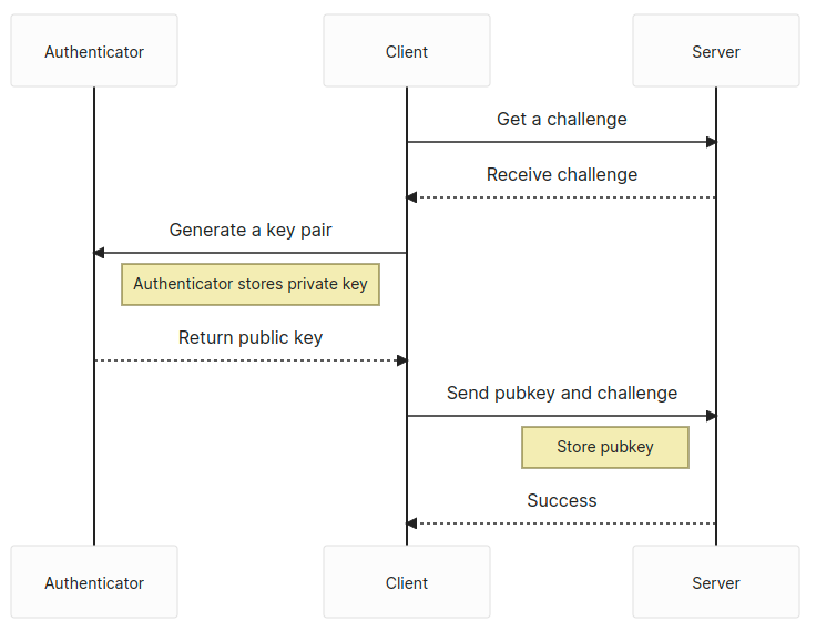
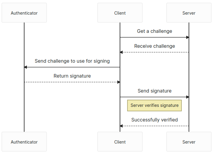
The process… in a nutshell

The process for generating a WebAuthn or a passkey is very similar: get a challenge from the server and then use the navigator.credentials.create web API to generate a public key pair. Then, send the challenge and the public key back to the server to be stored.

Upon receiving the public key and challenge, the server validates the challenge and the session from which it was created. If that checks out, the public key is stored, as well as any other relevant information like the user identifier or attestation data, in the database.

The user has one more step — retrieve another challenge from the server and use the navigator.credentials.get API to sign the challenge. We send back the signed challenge to the server, and the server verifies the challenge, then logs us in if the signature passes.

There is, of course, quite a bit more to each step. But that is generally how we’d log into a website using WebAuthn or passkeys.

The meat and potatoes

Passkeys are used in two distinct phases: the attestation and assertion phases.

The attestation phase can also be thought of as the registration phase. You’d sign up with an email and password for a new website, however, in this case, we’d be using our passkey.

The assertion phase is similar to how you’d log in to a website after signing up.

Attestation

View full size

The navigator.credentials.create API is the focus of our attestation phase. We’re registered as a new user in the system and need to generate a new public key pair. However, we need to specify what kind of key pair we want to generate. That means we need to provide options to navigator.credentials.create.

// The `challenge` is random and has to come from the server
const publicKey: PublicKeyCredentialCreationOptions = {
  challenge: safeEncode(challenge),
  rp: {
    id: window.location.host,
    name: document.title,
  },
  user: {
    id: new TextEncoder().encode(crypto.randomUUID()), // Why not make it random?
    name: 'Your username',
    displayName: 'Display name in browser',
  },
  pubKeyCredParams: [
    {
      type: 'public-key',
      alg: -7, // ES256
    },
    {
      type: 'public-key',
      alg: -256, // RS256
    },
  ],
  authenticatorSelection: {
    userVerification: 'preferred', // Do you want to use biometrics or a pin?
    residentKey: 'required', // Create a resident key e.g. passkey
  },
  attestation: 'indirect', // indirect, direct, or none
  timeout: 60_000,
};
const pubKeyCredential: PublicKeyCredential = await navigator.credentials.create({
  publicKey
});
const {
  id // the key id a.k.a. kid
} = pubKeyCredential;
const pubKey = pubKeyCredential.response.getPublicKey();
const { clientDataJSON, attestationObject } = pubKeyCredential.response;
const { type, challenge, origin } = JSON.parse(new TextDecoder().decode(clientDataJSON));
// Send data off to the server for registration

We’ll get PublicKeyCredential which contains an AuthenticatorAttestationResponse that comes back after creation. The credential has the generated key pair’s ID.

The response provides a couple of bits of useful information. First, we have our public key in this response, and we need to send that to the server to be stored. Second, we also get back the clientDataJSON property which we can decode, and from there, get back the typechallenge, and origin of the passkey.

For attestation, we want to validate the typechallenge, and origin on the server, as well as store the public key with its identifier, e.g. kid. We can also optionally store the attestationObject if we wish. Another useful property to store is the COSE algorithm, which is defined above in our  PublicKeyCredentialCreationOptions with alg: -7 or alg: -256, in order to easily verify any signed challenges in the assertion phase.

Assertion

View full size

The navigator.credentials.get API will be the focus of the assertion phase. Conceptually, this would be where the user logs in to the web application after signing up.

// The `challenge` is random and has to come from the server
const publicKey: PublicKeyCredentialRequestOptions = {
  challenge: new TextEncoder().encode(challenge),
  rpId: window.location.host,
  timeout: 60_000,
};
const publicKeyCredential: PublicKeyCredential = await navigator.credentials.get({
  publicKey,
  mediation: 'optional',
});
const {
  id // the key id, aka kid
} = pubKeyCredential;
const { clientDataJSON, attestationObject, signature, userHandle } = pubKeyCredential.response;
const { type, challenge, origin } = JSON.parse(new TextDecoder().decode(clientDataJSON));
// Send data off to the server for verification

We’ll again get a PublicKeyCredential with an AuthenticatorAssertionResponse this time. The credential again includes the key identifier.

We also get the typechallenge, and origin from the clientDataJSON again. The signature is now included in the response, as well as the authenticatorData. We’ll need those and the clientDataJSON to verify that this was signed with the private key.

The authenticatorData includes some properties that are worth tracking First is the SHA256 hash of the origin you’re using, located within the first 32 bytes, which is useful for verifying that request comes from the same origin server. Second is the signCount, which is from byte 33 to 37. This is generated from the authenticator and should be compared to its previous value to ensure that nothing fishy is going on with the key. The value should always 0 when it’s a multi-device passkey and should be randomly larger than the previous signCount when it’s a single-device passkey.

Once you’ve asserted your login, you should be logged in — congratulations! Passkeys is a pretty great protocol, but it does come with some caveats.

Some downsides

There’s a lot of upside to Passkeys, however, there are some issues with it at the time of this writing. For one thing, passkeys is somewhat still early support-wise, with only single-device credentials allowed on Windows and very little support for Linux systems. Passkeys.dev provides a nice table that’s sort of like the Caniuse of this protocol.

Also, Google’s and Apple’s passkeys platforms do not communicate with each other. If you want to get your credentials from your Android phone over to your iPhone… well, you’re out of luck for now. That’s not to say there is no interoperability! You can log in to your computer by using your phone as an authenticator. But it would be much cleaner just to have it built into the operating system and synced without it being locked at the vendor level.

Where are things going?

What does the passkeys protocol of the future look like? It looks pretty good! Once it gains support from more operating systems, there should be an uptake in usage, and you’ll start seeing it used more and more in the wild. Some password managers are even going to support them first-hand.

Passkeys are by no means only supported on the web. Android and iOS will both support native passkeys as first-class citizens. We’re still in the early days of all this, but expect to see it mentioned more and more.

After all, we eliminate the need for passwords, and by doing so, make the world safer for it!

Resources

Here are some more resources if you want to learn more about Passkeys. There’s also a repository and demo I put together for this article.


Passkeys: What the Heck and Why? originally published on CSS-Tricks, which is part of the DigitalOcean family. You should get the newsletter.


from CSS-Tricks https://ift.tt/rKmvtFJ
via IFTTT

Wednesday 22 March 2023

Some Cross-Browser DevTools Features You Might Not Know

I spend a lot of time in DevTools, and I’m sure you do too. Sometimes I even bounce between them, especially when I’m debugging cross-browser issues. DevTools is a lot like browsers themselves — not all of the features in one browser’s DevTools will be the same or supported in another browser’s DevTools.

But there are quite a few DevTools features that are interoperable, even some lesser-known ones that I’m about to share with you.

For the sake of brevity, I use “Chromium” to refer to all Chromium-based browsers, like Chrome, Edge, and Opera, in the article. Many of the DevTools in them offer the exact same features and capabilities as one another, so this is just my shorthand for referring to all of them at once.

Search nodes in the DOM tree

Sometimes the DOM tree is full of nodes nested in nodes that are nested in other nodes, and so on. That makes it pretty tough to find the exact one you’re looking for, but you can quickly search the DOM tree using Cmd + F (macOS) or Ctrl + F (Windows).

Additionally, you can also search using a valid CSS selector, like .red, or using an XPath, like //div/h1.

DevTools screenshots of all three browsers.
Searching text in Chrome DevTools (left), selectors in Firefox DevTools (center), and XPath in Safari DevTools (right)

In Chromium browsers, the focus automatically jumps to the node that matches the search criteria as you type, which could be annoying if you are working with longer search queries or a large DOM tree. Fortunately, you can disable this behavior by heading to Settings (F1) → PreferencesGlobalSearch as you typeDisable.

After you have located the node in the DOM tree, you can scroll the page to bring the node within the viewport by right-clicking on the nod, and selecting “Scroll into view”.

Showing a highlighted node on a webpage with a contextual menu open to scroll into view

Access nodes from the console

DevTools provides many different ways to access a DOM node directly from the console.

For example, you can use $0 to access the currently selected node in the DOM tree. Chromium browsers take this one step further by allowing you to access nodes selected in the reverse chronological order of historic selection using, $1, $2, $3, etc.

Currently selected node accessed from the Console in Edge DevTools

Another thing that Chromium browsers allow you to do is copy the node path as a JavaScript expression in the form of document.querySelector by right-clicking on the node, and selecting CopyCopy JS path, which can then be used to access the node in the console.

Here’s another way to access a DOM node directly from the console: as a temporary variable. This option is available by right-clicking on the node and selecting an option. That option is labeled differently in each browser’s DevTools:

  • Chromium: Right click → “Store as global variable”
  • Firefox: Right click → “Use in Console”
  • Safari: Right click → “Log Element”
Screenshot of DevTools contextual menus in all three browsers.
Access a node as a temporary variable in the console, as shown in Chrome (left), Firefox (center), and Safari (right)

Visualize elements with badges

DevTools can help visualize elements that match certain properties by displaying a badge next to the node. Badges are clickable, and different browsers offer a variety of different badges.

In Safari, there is a badge button in the Elements panel toolbar which can be used to toggle the visibility of specific badges. For example, if a node has a display: grid or display: inline-grid CSS declaration applied to it, a grid badge is displayed next to it. Clicking on the badge will highlight grid areas, track sizes, line numbers, and more, on the page.

A grid overlay visualized on top of a three-by-three grid.
Grid overlay with badges in Safari DevTools

The badges that are currently supported in Firefox’s DevTools are listed in the Firefox source docs. For example, a scroll badge indicates a scrollable element. Clicking on the badge highlights the element causing the overflow with an overflow badge next to it.

Overflow badge in Firefox DevTools located in the HTML panel

In Chromium browsers, you can right-click on any node and select “Badge settings…” to open a container that lists all of the available badges. For example, elements with scroll-snap-type will have a scroll-snap badge next to it, which on click, will toggle the scroll-snap overlay on that element.

Taking screenshots

We’ve been able to take screenshots from some DevTools for a while now, but it’s now available in all of them and includes new ways to take full-page shots.

The process starts by right-clicking on the DOM node you want to capture. Then select the option to capture the node, which is labeled differently depending on which DevTools you’re using.

Screenshot of DevTools in all three browsers.
Chrome (left), Safari (middle), and Firefox (right)

Repeat the same steps on the html node to take a full-page screenshot. When you do, though, it’s worth noting that Safari retains the transparency of the element’s background color — Chromium and Firefox will capture it as a white background.

Two screenshots of the same element, one with a background and one without.
Comparing screenshots in Safari (left) and Chromium (right)

There’s another option! You can take a “responsive” screenshot of the page, which allows you to capture the page at a specific viewport width. As you might expect, each browser has different ways to get there.

  • Chromium: Cmd + Shift + M (macOS) or Ctrl + Shift + M (Windows). Or click the “Devices” icon next to the “Inspect” icon.
  • Firefox: Tools → Browser Tools → “Responsive Design Mode”
  • Safari: Develop → “Enter Responsive Design Mode”
Enter responsive mode options in DevTools for all three browsers.
Launching responsive design mode in Safari (left), Firefox (right), and Chromium (bottom)

Chrome tip: Inspect the top layer

Chrome lets you visualize and inspect top-layer elements, like a dialog, alert, or modal. When an element is added to the #top-layer, it gets a top-layer badge next to it, which on click, jumps you to the top-layer container located just after the </html> tag.

The order of the elements in the top-layer container follows the stacking order, which means the last one is on the top. Click the reveal badge to jump back to the node.

Firefox tip: Jump to ID

Firefox links the element referencing the ID attribute to its target element in the same DOM and highlights it with an underline. Use CMD + Click (macOS) or CTRL + Click (Windows) )to jump to the target element with the identifier.

Wrapping up

Quite a few things, right? It’s awesome that there are some incredibly useful DevTools features that are supported in Chromium, Firefox, and Safari alike. Are there any other lesser-known features supported by all three that you like?

There are a few resources I keep close by to stay on top of what’s new. I thought I’d share them with here:


Some Cross-Browser DevTools Features You Might Not Know originally published on CSS-Tricks, which is part of the DigitalOcean family. You should get the newsletter.


from CSS-Tricks https://ift.tt/wx578ec
via IFTTT

Monday 13 March 2023

Making Calendars With Accessibility and Internationalization in Mind

Doing a quick search here on CSS-Tricks shows just how many different ways there are to approach calendars. Some show how CSS Grid can create the layout efficiently. Some attempt to bring actual data into the mix. Some rely on a framework to help with state management.

There are many considerations when building a calendar component — far more than what is covered in the articles I linked up. If you think about it, calendars are fraught with nuance, from handling timezones and date formats to localization and even making sure dates flow from one month to the next… and that’s before we even get into accessibility and additional layout considerations depending on where the calendar is displayed and whatnot.

Many developers fear the Date() object and stick with older libraries like moment.js. But while there are many “gotchas” when it comes to dates and formatting, JavaScript has a lot of cool APIs and stuff to help out!

January 2023 calendar grid.

I don’t want to re-create the wheel here, but I will show you how we can get a dang good calendar with vanilla JavaScript. We’ll look into accessibility, using semantic markup and screenreader-friendly <time> -tags — as well as internationalization and formatting, using the Intl.Locale, Intl.DateTimeFormat and Intl.NumberFormat-APIs.

In other words, we’re making a calendar… only without the extra dependencies you might typically see used in a tutorial like this, and with some of the nuances you might not typically see. And, in the process, I hope you’ll gain a new appreciation for newer things that JavaScript can do while getting an idea of the sorts of things that cross my mind when I’m putting something like this together.

First off, naming

What should we call our calendar component? In my native language, it would be called “kalender element”, so let’s use that and shorten that to “Kal-El” — also known as Superman’s name on the planet Krypton.

Let’s create a function to get things going:

function kalEl(settings = {}) { ... }

This method will render a single month. Later we’ll call this method from [...Array(12).keys()] to render an entire year.

Initial data and internationalization

One of the common things a typical online calendar does is highlight the current date. So let’s create a reference for that:

const today = new Date();

Next, we’ll create a “configuration object” that we’ll merge with the optional settings object of the primary method:

const config = Object.assign(
  {
    locale: (document.documentElement.getAttribute('lang') || 'en-US'), 
    today: { 
      day: today.getDate(),
      month: today.getMonth(),
      year: today.getFullYear() 
    } 
  }, settings
);

We check, if the root element (<html>) contains a lang-attribute with locale info; otherwise, we’ll fallback to using en-US. This is the first step toward internationalizing the calendar.

We also need to determine which month to initially display when the calendar is rendered. That’s why we extended the config object with the primary date. This way, if no date is provided in the settings object, we’ll use the today reference instead:

const date = config.date ? new Date(config.date) : today;

We need a little more info to properly format the calendar based on locale. For example, we might not know whether the first day of the week is Sunday or Monday, depending on the locale. If we have the info, great! But if not, we’ll update it using the Intl.Locale API. The API has a weekInfo object that returns a firstDay property that gives us exactly what we’re looking for without any hassle. We can also get which days of the week are assigned to the weekend:

if (!config.info) config.info = new Intl.Locale(config.locale).weekInfo || { 
  firstDay: 7,
  weekend: [6, 7] 
};

Again, we create fallbacks. The “first day” of the week for en-US is Sunday, so it defaults to a value of 7. This is a little confusing, as the getDay method in JavaScript returns the days as [0-6], where 0 is Sunday… don’t ask me why. The weekends are Saturday and Sunday, hence [6, 7].

Before we had the Intl.Locale API and its weekInfo method, it was pretty hard to create an international calendar without many **objects and arrays with information about each locale or region. Nowadays, it’s easy-peasy. If we pass in en-GB, the method returns:

// en-GB
{
  firstDay: 1,
  weekend: [6, 7],
  minimalDays: 4
}

In a country like Brunei (ms-BN), the weekend is Friday and Sunday:

// ms-BN
{
  firstDay: 7,
  weekend: [5, 7],
  minimalDays: 1
}

You might wonder what that minimalDays property is. That’s the fewest days required in the first week of a month to be counted as a full week. In some regions, it might be just one day. For others, it might be a full seven days.

Next, we’ll create a render method within our kalEl-method:

const render = (date, locale) => { ... }

We still need some more data to work with before we render anything:

const month = date.getMonth();
const year = date.getFullYear();
const numOfDays = new Date(year, month + 1, 0).getDate();
const renderToday = (year === config.today.year) && (month === config.today.month);

The last one is a Boolean that checks whether today exists in the month we’re about to render.

Semantic markup

We’re going to get deeper in rendering in just a moment. But first, I want to make sure that the details we set up have semantic HTML tags associated with them. Setting that up right out of the box gives us accessibility benefits from the start.

Calendar wrapper

First, we have the non-semantic wrapper: <kal-el>. That’s fine because there isn’t a semantic <calendar> tag or anything like that. If we weren’t making a custom element, <article> might be the most appropriate element since the calendar could stand on its own page.

Month names

The <time> element is going to be a big one for us because it helps translate dates into a format that screenreaders and search engines can parse more accurately and consistently. For example, here’s how we can convey “January 2023” in our markup:

<time datetime="2023-01">January <i>2023</i></time>

Day names

The row above the calendar’s dates containing the names of the days of the week can be tricky. It’s ideal if we can write out the full names for each day — e.g. Sunday, Monday, Tuesday, etc. — but that can take up a lot of space. So, let’s abbreviate the names for now inside of an <ol> where each day is a <li>:

<ol>
  <li><abbr title="Sunday">Sun</abbr></li>
  <li><abbr title="Monday">Mon</abbr></li>
  <!-- etc. -->
</ol>

We could get tricky with CSS to get the best of both worlds. For example, if we modified the markup a bit like this:

<ol>
  <li>
    <abbr title="S">Sunday</abbr>
  </li>
</ol>

…we get the full names by default. We can then “hide” the full name when space runs out and display the title attribute instead:

@media all and (max-width: 800px) {
  li abbr::after {
    content: attr(title);
  }
}

But, we’re not going that way because the Intl.DateTimeFormat API can help here as well. We’ll get to that in the next section when we cover rendering.

Day numbers

Each date in the calendar grid gets a number. Each number is a list item (<li>) in an ordered list (<ol>), and the inline <time> tag wraps the actual number.

<li>
  <time datetime="2023-01-01">1</time>
</li>

And while I’m not planning to do any styling just yet, I know I will want some way to style the date numbers. That’s possible as-is, but I also want to be able to style weekday numbers differently than weekend numbers if I need to. So, I’m going to include data-* attributes specifically for that: data-weekend and data-today.

Week numbers

There are 52 weeks in a year, sometimes 53. While it’s not super common, it can be nice to display the number for a given week in the calendar for additional context. I like having it now, even if I don’t wind up not using it. But we’ll totally use it in this tutorial.

We’ll use a data-weeknumber attribute as a styling hook and include it in the markup for each date that is the week’s first date.

<li data-day="7" data-weeknumber="1" data-weekend="">
  <time datetime="2023-01-08">8</time>
</li>

Rendering

Let’s get the calendar on a page! We already know that <kal-el> is the name of our custom element. First thing we need to configure it is to set the firstDay property on it, so the calendar knows whether Sunday or some other day is the first day of the week.

<kal-el data-firstday="${ config.info.firstDay }">

We’ll be using template literals to render the markup. To format the dates for an international audience, we’ll use the Intl.DateTimeFormat API, again using the locale we specified earlier.

The month and year

When we call the month, we can set whether we want to use the long name (e.g. February) or the short name (e.g. Feb.). Let’s use the long name since it’s the title above the calendar:

<time datetime="${year}-${(pad(month))}">
  ${new Intl.DateTimeFormat(
    locale,
    { month:'long'}).format(date)} <i>${year}</i>
</time>

Weekday names

For weekdays displayed above the grid of dates, we need both the long (e.g. “Sunday”) and short (abbreviated, ie. “Sun”) names. This way, we can use the “short” name when the calendar is short on space:

Intl.DateTimeFormat([locale], { weekday: 'long' })
Intl.DateTimeFormat([locale], { weekday: 'short' })

Let’s make a small helper method that makes it a little easier to call each one:

const weekdays = (firstDay, locale) => {
  const date = new Date(0);
  const arr = [...Array(7).keys()].map(i => {
    date.setDate(5 + i)
    return {
      long: new Intl.DateTimeFormat([locale], { weekday: 'long'}).format(date),
      short: new Intl.DateTimeFormat([locale], { weekday: 'short'}).format(date)
    }
  })
  for (let i = 0; i < 8 - firstDay; i++) arr.splice(0, 0, arr.pop());
  return arr;
}

Here’s how we invoke that in the template:

<ol>
  ${weekdays(config.info.firstDay,locale).map(name => `
    <li>
      <abbr title="${name.long}">${name.short}</abbr>
    </li>`).join('')
  }
</ol>

Day numbers

And finally, the days, wrapped in an <ol> element:

${[...Array(numOfDays).keys()].map(i => {
  const cur = new Date(year, month, i + 1);
  let day = cur.getDay(); if (day === 0) day = 7;
  const today = renderToday && (config.today.day === i + 1) ? ' data-today':'';
  return `
    <li data-day="${day}"${today}${i === 0 || day === config.info.firstDay ? ` data-weeknumber="${new Intl.NumberFormat(locale).format(getWeek(cur))}"`:''}${config.info.weekend.includes(day) ? ` data-weekend`:''}>
      <time datetime="${year}-${(pad(month))}-${pad(i)}" tabindex="0">
        ${new Intl.NumberFormat(locale).format(i + 1)}
      </time>
    </li>`
}).join('')}

Let’s break that down:

  1. We create a “dummy” array, based on the “number of days” variable, which we’ll use to iterate.
  2. We create a day variable for the current day in the iteration.
  3. We fix the discrepancy between the Intl.Locale API and getDay().
  4. If the day is equal to today, we add a data-* attribute.
  5. Finally, we return the <li> element as a string with merged data.
  6. tabindex="0" makes the element focusable, when using keyboard navigation, after any positive tabindex values (Note: you should never add positive tabindex-values)

To “pad” the numbers in the datetime attribute, we use a little helper method:

const pad = (val) => (val + 1).toString().padStart(2, '0');

Week number

Again, the “week number” is where a week falls in a 52-week calendar. We use a little helper method for that as well:

function getWeek(cur) {
  const date = new Date(cur.getTime());
  date.setHours(0, 0, 0, 0);
  date.setDate(date.getDate() + 3 - (date.getDay() + 6) % 7);
  const week = new Date(date.getFullYear(), 0, 4);
  return 1 + Math.round(((date.getTime() - week.getTime()) / 86400000 - 3 + (week.getDay() + 6) % 7) / 7);
}

I didn’t write this getWeek-method. It’s a cleaned up version of this script.

And that’s it! Thanks to the Intl.Locale, Intl.DateTimeFormat and Intl.NumberFormat APIs, we can now simply change the lang-attribute of the <html> element to change the context of the calendar based on the current region:

January 2023 calendar grid.
de-DE
January 2023 calendar grid.
fa-IR
January 2023 calendar grid.
zh-Hans-CN-u-nu-hanidec

Styling the calendar

You might recall how all the days are just one <ol> with list items. To style these into a readable calendar, we dive into the wonderful world of CSS Grid. In fact, we can repurpose the same grid from a starter calendar template right here on CSS-Tricks, but updated a smidge with the :is() relational pseudo to optimize the code.

Notice that I’m defining configurable CSS variables along the way (and prefixing them with ---kalel- to avoid conflicts).

kal-el :is(ol, ul) {
  display: grid;
  font-size: var(--kalel-fz, small);
  grid-row-gap: var(--kalel-row-gap, .33em);
  grid-template-columns: var(--kalel-gtc, repeat(7, 1fr));
  list-style: none;
  margin: unset;
  padding: unset;
  position: relative;
}
Seven-column calendar grid with grid lines shown.

Let’s draw borders around the date numbers to help separate them visually:

kal-el :is(ol, ul) li {
  border-color: var(--kalel-li-bdc, hsl(0, 0%, 80%));
  border-style: var(--kalel-li-bds, solid);
  border-width: var(--kalel-li-bdw, 0 0 1px 0);
  grid-column: var(--kalel-li-gc, initial);
  text-align: var(--kalel-li-tal, end); 
}

The seven-column grid works fine when the first day of the month is also the first day of the week for the selected locale). But that’s the exception rather than the rule. Most times, we’ll need to shift the first day of the month to a different weekday.

Showing the first day of the month falling on a Thursday.

Remember all the extra data-* attributes we defined when writing our markup? We can hook into those to update which grid column (--kalel-li-gc) the first date number of the month is placed on:

[data-firstday="1"] [data-day="3"]:first-child {
  --kalel-li-gc: 1 / 4;
}

In this case, we’re spanning from the first grid column to the fourth grid column — which will automatically “push” the next item (Day 2) to the fifth grid column, and so forth.

Let’s add a little style to the “current” date, so it stands out. These are just my styles. You can totally do what you’d like here.

[data-today] {
  --kalel-day-bdrs: 50%;
  --kalel-day-bg: hsl(0, 86%, 40%);
  --kalel-day-hover-bgc: hsl(0, 86%, 70%);
  --kalel-day-c: #fff;
}

I like the idea of styling the date numbers for weekends differently than weekdays. I’m going to use a reddish color to style those. Note that we can reach for the :not() pseudo-class to select them while leaving the current date alone:

[data-weekend]:not([data-today]) { 
  --kalel-day-c: var(--kalel-weekend-c, hsl(0, 86%, 46%));
}

Oh, and let’s not forget the week numbers that go before the first date number of each week. We used a data-weeknumber attribute in the markup for that, but the numbers won’t actually display unless we reveal them with CSS, which we can do on the ::before pseudo-element:

[data-weeknumber]::before {
  display: var(--kalel-weeknumber-d, inline-block);
  content: attr(data-weeknumber);
  position: absolute;
  inset-inline-start: 0;
  /* additional styles */
}

We’re technically done at this point! We can render a calendar grid that shows the dates for the current month, complete with considerations for localizing the data by locale, and ensuring that the calendar uses proper semantics. And all we used was vanilla JavaScript and CSS!

But let’s take this one more step

Rendering an entire year

Maybe you need to display a full year of dates! So, rather than render the current month, you might want to display all of the month grids for the current year.

Well, the nice thing about the approach we’re using is that we can call the render method as many times as we want and merely change the integer that identifies the month on each instance. Let’s call it 12 times based on the current year.

as simple as calling the render-method 12 times, and just change the integer for monthi:

[...Array(12).keys()].map(i =>
  render(
    new Date(date.getFullYear(),
    i,
    date.getDate()),
    config.locale,
    date.getMonth()
  )
).join('')

It’s probably a good idea to create a new parent wrapper for the rendered year. Each calendar grid is a <kal-el> element. Let’s call the new parent wrapper <jor-el>, where Jor-El is the name of Kal-El’s father.

<jor-el id="app" data-year="true">
  <kal-el data-firstday="7">
    <!-- etc. -->
  </kal-el>

  <!-- other months -->
</jor-el>

We can use <jor-el> to create a grid for our grids. So meta!

jor-el {
  background: var(--jorel-bg, none);
  display: var(--jorel-d, grid);
  gap: var(--jorel-gap, 2.5rem);
  grid-template-columns: var(--jorel-gtc, repeat(auto-fill, minmax(320px, 1fr)));
  padding: var(--jorel-p, 0);
}

Final demo

Bonus: Confetti Calendar

I read an excellent book called Making and Breaking the Grid the other day and stumbled on this beautiful “New Year’s poster”:

Source: Making and Breaking the Grid (2nd Edition) by Timothy Samara

I figured we could do something similar without changing anything in the HTML or JavaScript. I’ve taken the liberty to include full names for months, and numbers instead of day names, to make it more readable. Enjoy!


Making Calendars With Accessibility and Internationalization in Mind originally published on CSS-Tricks, which is part of the DigitalOcean family. You should get the newsletter.


from CSS-Tricks https://ift.tt/4la8eAB
via IFTTT

Friday 10 March 2023

5 Mistakes I Made When Starting My First React Project

You know what it’s like to pick up a new language or framework. Sometimes there’s great documentation to help you find your way through it. But even the best documentation doesn’t cover absolutely everything. And when you work with something that’s new, you’re bound to find a problem that doesn’t have a written solution.

That’s how it was for me the first time I created a React project — and React is one of those frameworks with remarkable documentation, especially now with the beta docs. But I still struggled my way through. It’s been quite a while since that project, but the lessons I gained from it are still fresh in my mind. And even though there are a lot of React “how-to” tutorials in out there, I thought I’d share what I wish I knew when I first used it.

So, that’s what this article is — a list of the early mistakes I made. I hope they help make learning React a lot smoother for you.

Using create-react-app to start a project

TL;DR Use Vite or Parcel.

Create React App (CRA) is a tool that helps you set up a new React project. It creates a development environment with the best configuration options for most React projects. This means you don’t have to spend time configuring anything yourself.

As a beginner, this seemed like a great way to start my work! No configuration! Just start coding!

CRA uses two popular packages to achieve this, webpack and Babel. webpack is a web bundler that optimizes all of the assets in your project, such as JavaScript, CSS, and images. Babel is a tool that allows you to use newer JavaScript features, even if some browsers don’t support them.

Both are good, but there are newer tools that can do the job better, specifically Vite and Speedy Web Compiler (SWC).

These new and improved alternatives are faster and easier to configure than webpack and Babel. This makes it easier to adjust the configuration which is difficult to do in create-react-app without ejecting.

To use them both when setting up a new React project you have to make sure you have Node version 12 or higher installed, then run the following command.

npm create vite

You’ll be asked to pick a name for your project. Once you do that, select React from the list of frameworks. After that, you can select either Javascript + SWC or Typescript + SWC

Then you’ll have to change directory cd into your project and run the following command;

npm i && npm run dev

This should run a development server for your site with the URL localhost:5173

And it’s as simple as that.

Using defaultProps for default values

TL;DR Use default function parameters instead.

Data can be passed to React components through something called props. These are added to a component just like attributes in an HTML element and can be used in a component’s definition by taking the relevant values from the prop object passed in as an argument.

// App.jsx
export default function App() {
  return <Card title="Hello" description="world" />
}

// Card.jsx
function Card(props) {
  return (
    <div>
      <h1>{props.title}</h1>
      <p>{props.description}</p>
    </div>
  );
}

export default Card;

If a default value is ever required for a prop, the defaultProp property can be used:

// Card.jsx
function Card(props) {
  // ...
}

Card.defaultProps = {
  title: 'Default title',
  description: 'Desc',
};

export default Card;

With modern JavaScript, it is possible to destructure the props object and assign a default value to it all in the function argument.

// Card.jsx
function Card({title = "Default title", description= "Desc"}) {
  return (
    <div>
      <h1>{title}</h1>
      <p>{description}</p>
    </div>
  )
}

export default Card;

This is more favorable as the code that can be read by modern browsers without the need for extra transformation.

Unfortunately, defaultProps do require some transformation to be read by the browser since JSX (JavaScript XML) isn’t supported out of the box. This could potentially affect the performance of an application that is using a lot of defaultProps.

Don’t use propTypes

TL;DR Use TypeScript.

In React, the propTypes property can be used to check if a component is being passed the correct data type for its props. They allow you to specify the type of data that should be used for each prop such as a string, number, object, etc. They also allow you to specify if a prop is required or not.

This way, if a component is passed the wrong data type or if a required prop is not being provided, then React will throw an error.

// Card.jsx
import { PropTypes } from "prop-types";

function Card(props) {
  // ...
}

Card.propTypes = {
  title: PropTypes.string.isRequired,
  description: PropTypes.string,
};

export default Card;

TypeScript provides a level of type safety in data that’s being passed to components. So, sure, propTypes were a good idea back when I was starting. However, now that TypeScript has become the go-to solution for type safety, I would highly recommend using it over anything else.

// Card.tsx
interface CardProps {
  title: string,
  description?: string,
}

export default function Card(props: CardProps) {
  // ...
}

TypeScript is a programming language that builds on top of JavaScript by adding static type-checking. TypeScript provides a more powerful type system, that can catch more potential bugs and improves the development experience.

Using class components

TL;DR: Write components as functions

Class components in React are created using JavaScript classes. They have a more object-oriented structure and as well as a few additional features, like the ability to use the this keyword and lifecycle methods.

// Card.jsx
class Card extends React.Component {
  render() {
    return (
      <div>
        <h1>{this.props.title}</h1>
        <p>{this.props.description}</p>
      </div>
    )
  }
}

export default Card;

I prefer writing components with classes over functions, but JavaScript classes are more difficult for beginners to understand and this can get very confusing. Instead, I’d recommend writing components as functions:

// Card.jsx
function Card(props) {
  return (
    <div>
      <h1>{props.title}</h1>
      <p>{props.description}</p>
    </div>
  )
}

export default Card;

Function components are simply JavaScript functions that return JSX. They are much easier to read, and do not have additional features like the this keyword and lifecycle methods which make them more performant than class components.

Function components also have the advantage of using hooks. React Hooks allow you to use state and other React features without writing a class component, making your code more readable, maintainable and reusable.

Importing React unnecessarily

TL;DR: There’s no need to do it, unless you need hooks.

Since React 17 was released in 2020, it’s now unnecessary to import React at the top of your file whenever you create a component.

import React from 'react'; // Not needed!
export default function Card() {}

But we had to do that before React 17 because the JSX transformer (the thing that converts JSX into regular JavaScript) used a method called React.createElement that would only work when importing React. Since then, a new transformer has been release which can transform JSX without the createElement method.

You will still need to import React to use hooks, fragments, and any other functions or components you might need from the library:

import { useState } from 'react';

export default function Card() {
  const [count, setCount] = useState(0);
  // ...
}

Those were my early mistakes!

Maybe “mistake” is too harsh a word since some of the better practices came about later. Still, I see plenty of instances where the “old” way of doing something is still being actively used in projects and other tutorials.

To be honest, I probably made way more than five mistakes when getting started. Anytime you reach for a new tool it is going to be more like a learning journey to use it effectively, rather than flipping a switch. But these are the things I still carry with me years later!

If you’ve been using React for a while, what are some of the things you wish you knew before you started? It would be great to get a collection going to help others avoid the same struggles.


5 Mistakes I Made When Starting My First React Project originally published on CSS-Tricks, which is part of the DigitalOcean family. You should get the newsletter.


from CSS-Tricks https://ift.tt/tRWJucH
via IFTTT

Passkeys: What the Heck and Why?

These things called  passkeys  sure are making the rounds these days. They were a main attraction at  W3C TPAC 2022 , gained support in  Saf...